Widget Builder
The Widget Builder builds two areas of your site from small reusable widgets:
- Your Footer (the section at the bottom of every page).
- Your Blog Sidebar (the column beside your blog posts).
Open it from Appearance → Widget Builder.
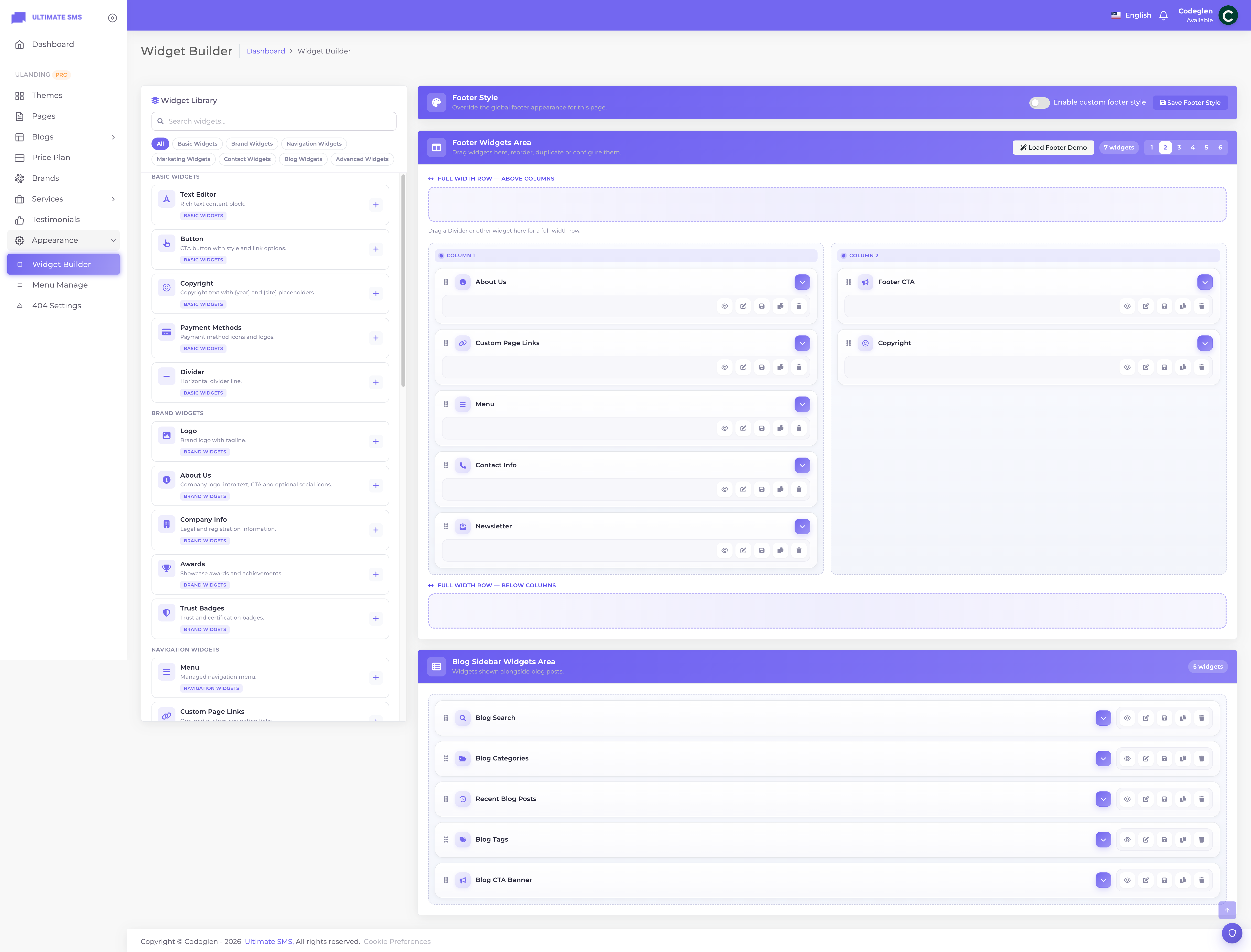
Screenshot: Appearance → Widget Builder
For footer styling (background, colors, layout type), also see Footer Builder.
How the Widget Builder works
- Choose an area to work on: Footer or Blog Sidebar.
- Set the number of columns for that area (1–6; default 4 for footer, 1 for sidebar).
- Drag widgets from the library into the columns.
- Click a widget to edit its content and design.
- Reorder by dragging, duplicate, delete, preview and Save.
The footer also has full‑width drop zones above and below the columns for widgets that should span the entire width (like a Footer CTA or Divider).
Common controls on every widget
Every widget shares these controls (the per‑widget sections below won't repeat them):
Theme Mode
Inherit / Light / Dark — force this widget's color mode.
Design tab
Most widgets (all except Text Editor and Recent Blog Posts) have a Design tab with:
- Background: none / color / gradient / image (with size & position).
- Border: style, width, color, radius.
Typography tab
- Font family, size, weight, line height, letter spacing, color, alignment.
Spacing tab
- Padding (top/right/bottom/left) and margin (top/right/bottom/left).
Advanced tab
- Hide on desktop / tablet / mobile — show or hide the widget per device.
Tip Use Hide on mobile to remove non‑essential footer widgets on small screens for a cleaner mobile footer.
Widget categories
The library groups widgets into: Basic, Brand, Navigation, Marketing, Contact, Blog, and Advanced. Blog widgets only appear in the Blog Sidebar area.
The 28 widgets
Basic widgets
Text Editor
A rich‑text content block. Fields: title, content. (No design tab.) Use for free‑form paragraphs in a footer column or sidebar.
Button
A call‑to‑action button. Fields: text, URL, icon, style (primary / outline / rounded / link), alignment, background color, text color, open in new tab.
Copyright
A copyright line (footer only). Fields: text (use {year} and {site} placeholders), alignment.
Default: © {year} {site}. All rights reserved.
Payment Methods
Payment/card icons. Fields: title (default "We Accept"), layout (row / grid), and items (each: label + image).
Divider
A horizontal divider (full‑width). Fields: placement (before / after), style (line / dots), color, width (%), margin top/bottom.
Brand widgets
Logo
Your brand logo (footer only). Fields: logo, width (default 150px), link, alt text, tagline.
About Us
Logo + intro + CTA. Fields: title, short description, layout (default / centered / split), icon color, logo / dark logo / light logo, signature image, CTA button text, CTA URL, social (enable + items of icon/URL).
Company Info
Legal/registration details. Fields: title (default "Company Info"), company name, registration number, VAT, founded year.
Awards
Awards showcase. Fields: title (default "Awards") and items (each: title, year, image).
Trust Badges
Certification/trust badges. Fields: title, columns (2/3/4/6), and items (each: image + alt text).
Navigation widgets
Menu
A managed navigation menu (from Menu Manage). Fields: title, menu (select), layout (vertical / horizontal / columns), columns (1/2/3).
Custom Page Links
Grouped custom links. Fields: title, layout (list / columns), link color / hover color, and groups (each group: title + links, each link: icon, label, URL, new tab).
Marketing widgets
Newsletter
Email signup form. Fields: title, description, layout (stacked / inline), action (form URL), placeholder, button text, button icon, success message, and input/button colors.
Footer CTA
A call‑to‑action block (footer only). Fields: subtitle (default "Get in touch"), title, button text (default "Contact Us"), button URL, button icon, show social + social items, open in new tab.
Download App
App store links. Fields: title (default "Download Our App"), description, App Store URL, Play Store URL, QR image, open in new tab.
Instagram Gallery
A grid of images. Fields: title (default "Instagram"), columns (2/3/4/6), open in new tab, and items (each: image + URL).
Blog CTA Banner (blog sidebar)
A promotional banner for the blog sidebar. Fields: title, subtitle, description, badge text, discount text, heading, button text (default "Let's Talk"), button URL (default /contact), background/banner image, avatar image, overlay color, border radius, alignment.
Contact widgets
Contact Info
Contact details with icons. Fields: title, address, email, phone, whatsapp, business hours, map URL, custom items (icon/text/link), and icon/link colors.
Quick Contact
Phone, email and WhatsApp links. Fields: title (default "Quick Contact"), phone / email / whatsapp, labels for each, and an accent color.
Opening Hours
A business‑hours schedule. Fields: title (default "Working Time"), icon color, and items (each: day + hours).
Office Locations
Multiple office cards. Fields: title, open in new tab, and items (each: name, address, map URL).
Google Map
An embedded Google Map. Fields: title, latitude / longitude, embed URL (preferred), map URL (legacy), height (200–800px), border radius, background color, responsive.
Social Links
Social icon links (from your Social settings or custom). Fields: title, layout (icons / icon‑text / buttons), open in new tab, use brand color, icon/hover colors, and items (icon, label, URL).
Blog widgets (Blog Sidebar only)
Blog Search
A search box for posts. Fields: placeholder (default "Search"), search icon, button text, and input/button colors.
Blog Categories
A list of blog categories. Fields: title, show count, show icon, layout (list / cards / compact), hover style (underline / highlight / none), link/hover colors.
Popular Blogs
Popular, recent or featured posts. Fields: title, source (popular / recent / featured), post count (1–20), layout (list / cards / compact), show thumbnail, show date, show category, show read time.
Recent Blog Posts
The latest posts. Fields: title, limit (1–20). (No design tab.)
Blog Tags
A tag cloud. Fields: title, tag source (auto / custom), limit (1–50), custom tags (name + URL), tag/hover/border colors, rounded style (pill / rounded / square).
Advanced widgets
Custom HTML
A raw HTML block for embeds and custom markup. Field: html.
Warning The Custom HTML widget runs whatever HTML you paste. Only paste code you trust. A broken tag can affect the layout around it.
Building a great footer (recommended setup)
A classic 4‑column footer:
| Column 1 | Column 2 | Column 3 | Column 4 |
|---|---|---|---|
| Logo + About Us + Social Links | Menu (Company) | Custom Links (Resources) | Contact Info + Newsletter |
Plus:
- A Footer CTA in the full‑width zone before the columns.
- A Copyright widget (or use the Customizer's footer bottom bar).
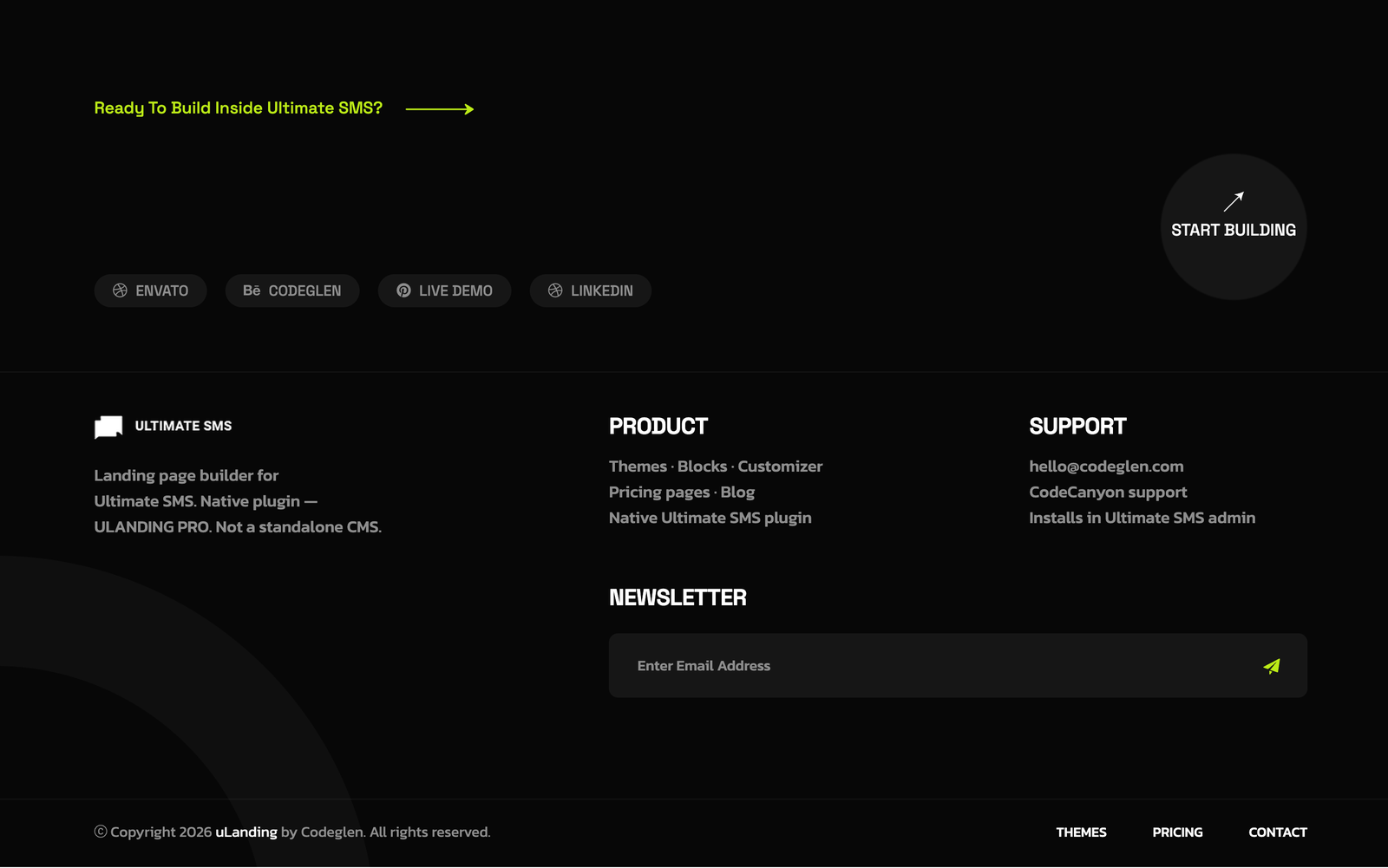
Screenshot: A finished 4‑column footer on the live site
Building a blog sidebar (recommended setup)
- Blog Search
- Blog Categories
- Popular Blogs (or Recent Blog Posts)
- Blog Tags
- Blog CTA Banner
Troubleshooting
| Problem | Fix |
|---|---|
| Footer is empty on the site | Add widgets and Save; confirm the theme's footer type is set |
| A widget doesn't appear | Check "Hide on…" device settings in its Advanced tab |
| Blog widgets missing from library | They only show in the Blog Sidebar area |
| Newsletter form doesn't submit | Set a valid action URL and check email settings |
| Google Map blank | Use a proper Google Maps embed URL |
| Changes not visible | Save, then clear caches (php artisan optimize:clear) |
More fixes in Troubleshooting.
Continue to Services.