Hero Section
The Hero is the large banner at the very top of a page — the first thing visitors see. It sets the tone and usually carries your main headline and primary button.
Purpose
Use a Hero to:
- Grab attention with a bold headline.
- Explain in one sentence what you do.
- Drive action with a primary button (and optional video).
- Show social proof (customer count, ratings) or a featured image.
Almost every page benefits from a Hero at the top, especially your homepage.
Available layouts
The Hero offers 10 layouts. Pick the one that matches your theme and content:
| Layout | Best for |
|---|---|
| Agency (default) | General agencies — headline, description, button. |
| AI Business | AI/tech companies with a modern split layout. |
| AI Agency | AI agencies with shape graphics and animated titles. |
| Consulting | Consulting firms — thumbnail with decorative shapes and a slider. |
| SEO | SEO/marketing — headline with a highlighted keyword and dashboard image. |
| Portfolio | Personal brands — name, role, intro and a portrait. |
| Web Design | Web studios — intro text, right‑side image, social links. |
| Startup | Startups — multi‑line title and dual buttons. |
| IT Solution | IT providers. |
| Video | A hero with a prominent video button/popup. |
Tip Each theme has a Hero layout that matches its style. If you imported a demo, the right layout is already chosen.
Field reference
Fields shown depend on the chosen layout. Common fields across layouts:
Content
| Field | What it does |
|---|---|
| Hero title lines | Your main headline, entered as one or more lines for styling. |
| Hero badge text | A small label above the title (e.g. "Welcome"). |
| Description text | A supporting paragraph under the headline. |
| Button text / URL | Your primary call‑to‑action. |
| Video URL | A video to play in a popup (where the layout supports it). |
| Video button label | The text next to the play button. |
Social proof (where supported)
| Field | What it does |
|---|---|
| Show customer proof | Toggle a "trusted by" element. |
| Avatar image | A row of customer avatars. |
| Customer count | E.g. "2,000+". |
| Customer proof text | E.g. "happy clients". |
Social links (where supported)
| Field | What it does |
|---|---|
| Show social | Show vertical social icons. |
| Follow label | A label like "Follow us". |
| Social links | The icon URLs. |
Sidebar / featured card (where supported)
| Field | What it does |
|---|---|
| Show sidebar | A side card next to the hero. |
| Sidebar headline | The card's heading. |
| Card label / title / URL | The card's content and link. |
Layout‑specific fields
- SEO layout: title text, highlighted word, description, button, video label, dashboard image, shape image.
- Portfolio layout: subtitle, name, title, inline image, description, resume button, portrait image.
- Web Design layout: intro text, right image, right heading/description, bottom title (with highlight) and social links.
- AI Startup/Agency: ratings text, multi‑part animated titles, shape images (with parallax speed), thumbnail.
- Consulting: thumbnail with decorative shapes, subtitle, multi‑line title, two buttons, slider items.
- Startup: subtitle, multi‑line title, button.
Style
| Field | What it does |
|---|---|
| Background image | The hero's background. |
| Padding top / bottom | Vertical spacing (each layout has sensible defaults). |
Best practices
- One clear headline. Say what you do and who it's for. Avoid jargon.
- One primary button. Don't dilute attention with five buttons. Pick the single most important action.
- Readable text over images. If you use a background image, add an overlay or use a layout with a solid panel so text stays legible.
- Show proof. Customer counts, ratings or recognizable client avatars build instant trust.
- Keep it light. Optimize your background image (under ~300 KB) so the page loads fast.
Example
A digital agency homepage hero:
- Layout: Agency
- Badge: "Creative Digital Agency"
- Title lines: "We Help Brands" / "Grow Online"
- Description: "Full‑service marketing that turns clicks into customers."
- Button: "Get a Free Audit" →
/contact - Show customer proof: on, "500+ happy clients"
Frontend result
Visitors see a full‑width banner with your headline, supporting text and primary button — often with a background image, video popup, or featured image depending on the layout. It adapts to mobile automatically, stacking the text and image.
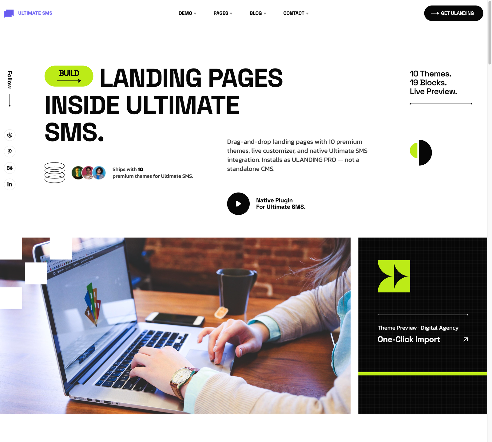
Screenshot: Page Builder → Hero Section (Agency layout) on the live site
Troubleshooting & common mistakes
| Problem | Fix |
|---|---|
| Text is hard to read over the image | Use a darker overlay, a different layout, or a lighter/darker background image. |
| Video popup doesn't open | Make sure the Video URL is a full, valid YouTube/Vimeo/MP4 link. |
| Hero looks empty on mobile | Shorten the headline; very long titles wrap awkwardly on phones. |
| Wrong layout style vs. theme | Switch to the Hero layout that matches your active theme. |
| Background image looks stretched | Use a wide image (e.g. 1920×1080) sized for hero backgrounds. |
Common mistakes: using more than one primary button, writing a vague headline, uploading a huge un‑optimized background image, and forgetting to set the button URL.
➡️ Next: About Section