Off‑Canvas Panel
The off‑canvas is the panel that slides in from the side of the screen when a visitor taps the menu (hamburger) button. It's especially important on mobile, where it usually holds your whole menu, contact details and a call‑to‑action.
Configure it from Themes → Customizer → Off‑Canvas.
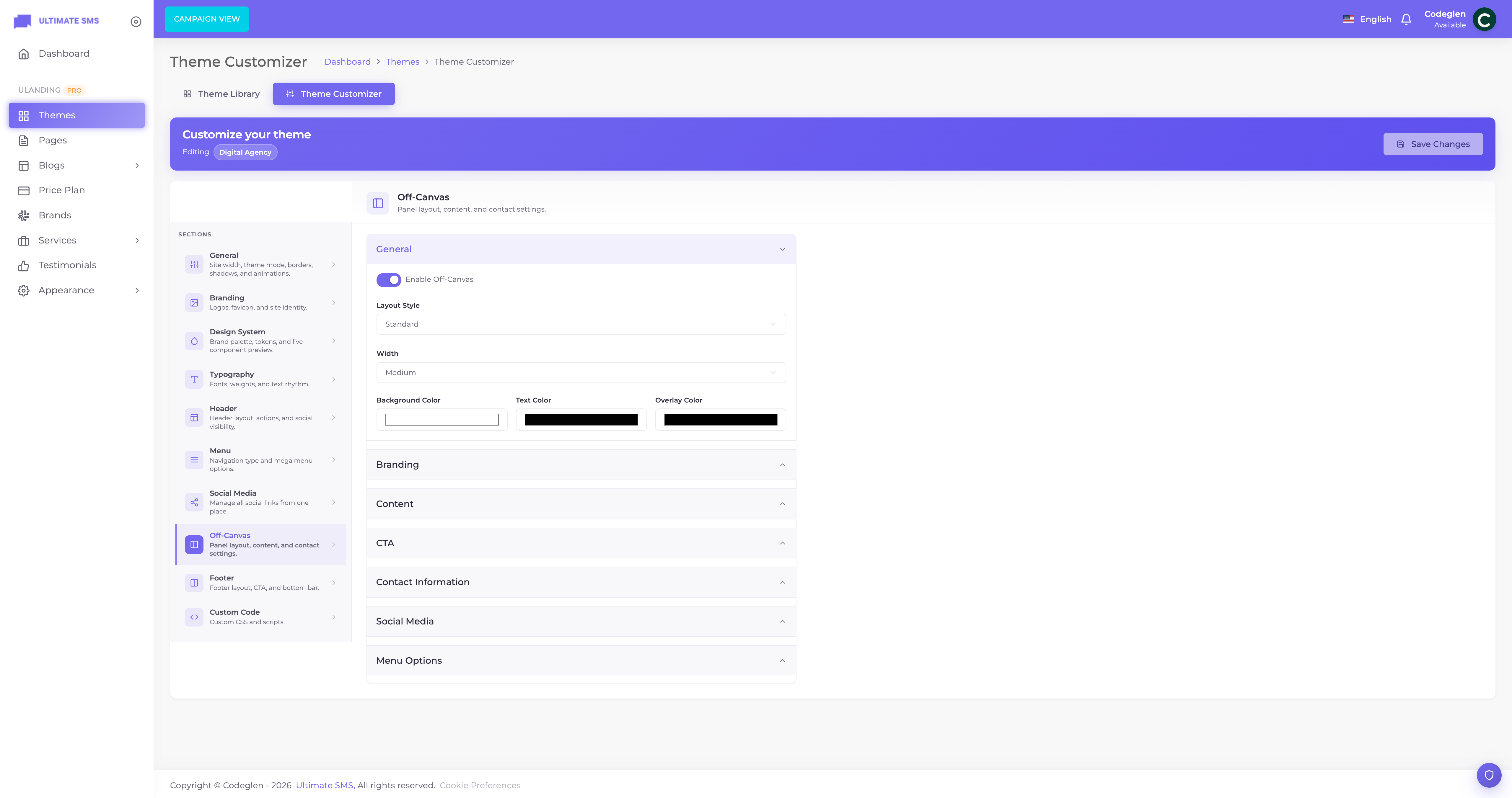
Screenshot: Customizer → Off-Canvas panel
The off‑canvas settings are organized into tabs: General, Branding, Contact, Social, Menu, CTA, and Top bar.
General tab
| Setting | Options | What it does |
|---|---|---|
| Off‑canvas enabled | On / Off | Turn the slide‑in panel on or off. |
| Layout | Standard / Minimal / Agency / SaaS | The overall design of the panel. |
| Width | Small / Medium / Large / Custom | How wide the panel is. |
| Custom width | e.g. 420px |
Used when Width is set to Custom. |
| Background color | color | The panel's background. |
| Text color | color | The panel's text. |
| Overlay color | color | The dimmed background behind the panel when it's open. |
Tip A semi‑transparent dark overlay color helps the panel stand out and focuses attention on the menu.
Branding tab
Show your logo and a short intro at the top of the panel.
| Setting | What it does |
|---|---|
| Logo | The logo shown inside the panel. |
| Dark logo | A version for dark panel backgrounds. |
| Logo width | The logo size (default 150). |
| Remove logo / Remove dark logo | Clear an uploaded logo. |
Content (intro text)
| Setting | What it does |
|---|---|
| Brand title | A heading, e.g. "Hello There!". |
| Brand subtitle | A short supporting line. |
| Brand description | A paragraph introducing your business (up to 1000 characters). |
Contact tab
Show contact details inside the panel. There are two section titles and a set of contact rows.
| Setting | Default | What it does |
|---|---|---|
| Information title | "Information" | Heading above the info block. |
| Get in touch title | "Get In Touch" | Heading above the contact block. |
For each of Phone, Email, WhatsApp, Address and Working hours you can set:
- Enabled — show this row or not.
- Icon — the icon shown next to it.
- Label — a label (e.g. "Call us").
- Value — the actual phone/email/address.
- URL — an optional link (e.g. a
tel:ormailto:link).
Example Phone → enabled, icon: phone, label: "Call Us", value: "+1 555 123 4567", URL:
tel:+15551234567.
Social tab
Show your social icons (from Customizer → Social) inside the panel.
| Setting | Options |
|---|---|
| Show social | On / Off |
| Social title | e.g. "Follow Us" |
| Position | Top / After description / Before contact / Bottom |
| Alignment | Left / Center / Right |
| Style | Default / Rounded / Circle / Square |
| Size | Small / Medium / Large |
| Color mode | Inherit / Custom |
| Color & hover color | Used when color mode is Custom |
Menu tab
Show a navigation menu inside the panel.
| Setting | Options | What it does |
|---|---|---|
| Menu source | Primary / Secondary / Custom / Mega | Which menu to display. |
| Custom menu | (a menu) | Used when source is Custom. |
| Show menu | On / Off | Show the menu at all. |
| Show description | On / Off | Show item descriptions (for mega items). |
| Show icons | On / Off | Show item icons. |
| Show badges | On / Off | Show item badges. |
| Show CTA | On / Off | Show a CTA inside the menu. |
| Show login | On / Off | Show the Sign In link. |
| Show signup | On / Off | Show the Sign Up link. |
Tip For the Personal Portfolio, Creative Agency and IT Consulting themes, the off‑canvas is the main menu (menu type = off‑canvas), so make sure Show menu is on and your menu is selected.
CTA tab
A call‑to‑action block at the bottom of the panel.
| Setting | Default | What it does |
|---|---|---|
| CTA enabled | — | Show the CTA block. |
| Small title | — | A small line above the title. |
| Title | — | The main CTA heading. |
| Description | — | Supporting text. |
| Button label | — | The button text. |
| Button URL | — | Where the button links. |
| Button style | Primary / Secondary / Outline / Ghost | The button appearance. |
| Background color | #C4EE18 |
The CTA block background. |
| Text color | #030303 |
The CTA text color. |
| Border radius | 12 |
Corner roundness. |
| Background image | — | An optional background image for the block. |
Top bar tab
The off‑canvas builder also configures the site top bar announcement (the same top bar shown in the header).
| Setting | Options |
|---|---|
| Top bar enabled | On / Off |
| Variant | Auto / Theme default / SaaS / Agency / Minimal / Hidden |
| Layout | Default / Centered / Split / Minimal |
| Announcement text | Your message |
| Announcement highlight | A highlighted word/phrase |
| Announcement mode | Static / Marquee (scrolling) |
| Announcement button label | Optional button text |
| Announcement button URL | Where the button links |
| Contact (phone/email/address/working hours) | Shown in the top bar |
| Show social | On / Off |
Tip Use Marquee mode for a moving announcement strip — great for sales or important notices.
Off‑canvas width reference
| Width setting | Result |
|---|---|
| Small | A narrow panel |
| Medium | A balanced default |
| Large | A spacious panel |
| Custom | Exactly the pixels you enter (e.g. 420px) |
Off‑canvas checklist
- [ ] Enable the off‑canvas
- [ ] Pick a layout and width
- [ ] Add your logo and intro text
- [ ] Fill in contact details and working hours
- [ ] Turn on social icons and choose a position
- [ ] Select the menu to show (especially for off‑canvas‑menu themes)
- [ ] Add a CTA block
- [ ] Configure or hide the top bar
Continue to Footer Builder.