CTA Section
The CTA (call‑to‑action) block is a focused band that asks visitors to take one action — contact you, subscribe, or get started.
Purpose
Place a CTA near the bottom of a page (and sometimes mid‑page) to convert interested visitors. It's often the most important block on the page after the Hero.
Available layouts
6 layouts:
| Layout | Best for |
|---|---|
| AI Background Distortion (default) | A bold band with an animated distorted background. |
| AI Centered Shapes | Centered text with decorative shapes. |
| Newsletter Subscribe | An email signup CTA. |
| Inline Advice Bar | A slim inline bar. |
| Let's Talk Centered | A centered "let's talk" prompt. |
| Let's Talk Split | A split "let's talk" layout. |
Field reference
| Field | What it does |
|---|---|
| Subtitle | A small line above the title. |
| Title | The main call‑to‑action heading (supports light styling/HTML). |
| Description | Supporting text (where the layout supports it). |
| A contact email (some layouts). | |
| Link prefix | A prefix before a link (Let's Talk Split). |
| Button text / URL | The action button. |
| Background image | A backdrop (AI Distortion, Inline Advice Bar). |
| Noise image | A texture overlay. |
| Decorative shapes | Shape graphics for decoration. |
| Theme | Dark/light (most layouts default to dark for contrast). |
Best practices
- One action only. A CTA with a single, clear button converts best.
- Use action words. "Get Your Free Quote", "Start Free Trial", "Book a Call".
- Create contrast. A dark CTA on a light page (or vice‑versa) draws the eye — use the per‑block Theme Mode.
- Reduce friction. Make the button go straight to the next step (contact form, signup).
Example
- Layout: Let's Talk Centered
- Subtitle: "Ready to grow?"
- Title: "Let's build something great together"
- Button: "Get a Free Consultation" →
/contact - Theme: Dark
Frontend result
A prominent, full‑width band with your headline and a single button, often with a decorative or animated background.
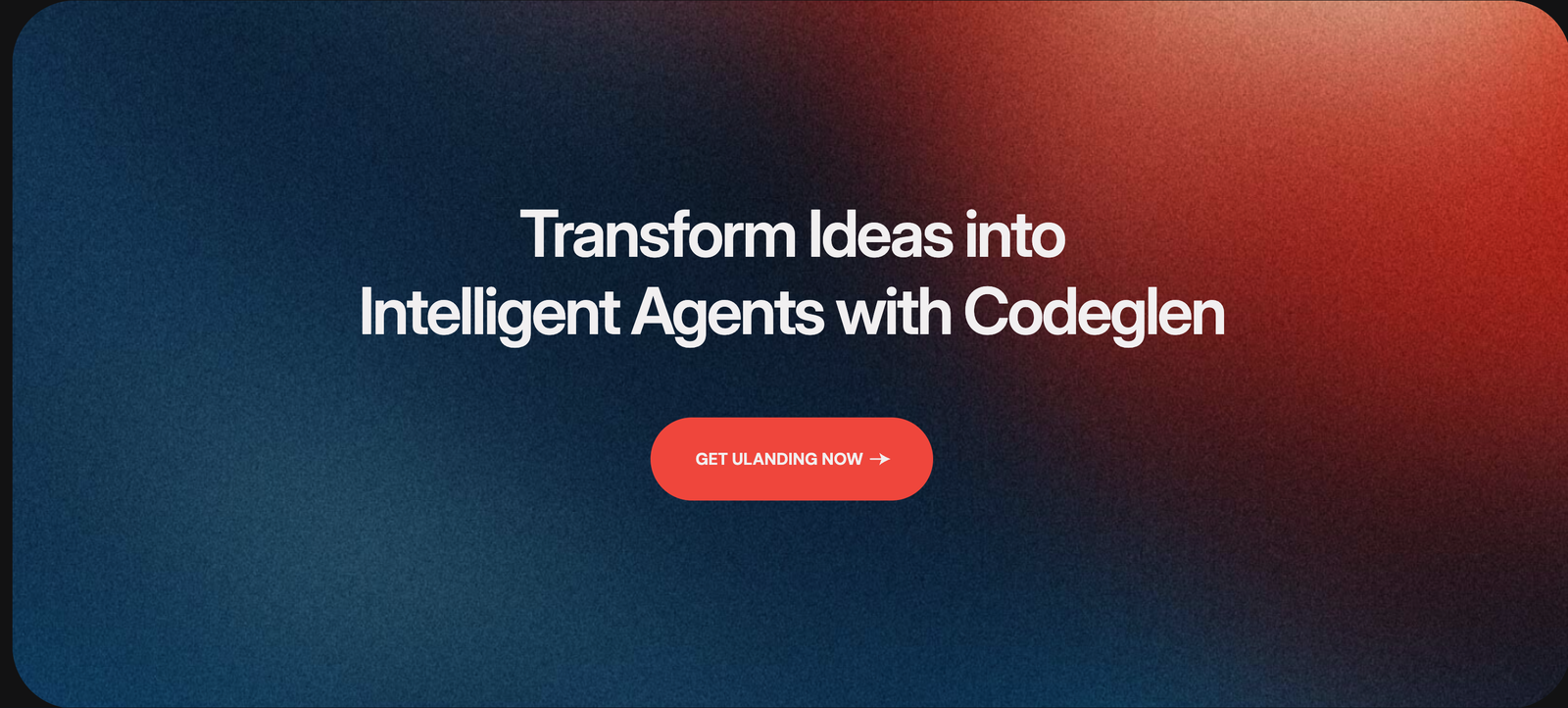
Screenshot: Page Builder → CTA Section (Let's Talk Centered) on the live site
Troubleshooting & common mistakes
| Problem | Fix |
|---|---|
| Button goes nowhere | Set the button URL. |
| Text unreadable on background | Switch theme mode, or use the overlay/noise to darken the background. |
| Animation too heavy | Choose a simpler layout or lower the Customizer animation level. |
Common mistakes: multiple competing buttons, vague wording ("Submit"), low contrast.
➡️ Next: Process Section