Theme Customizer
The Theme Customizer is the control center for your site's appearance. It's where you set your colors, fonts, logo, header, footer, menu, social links and the slide‑in off‑canvas panel — all with a live preview that updates as you change things.
Open it from Themes → Customizer.
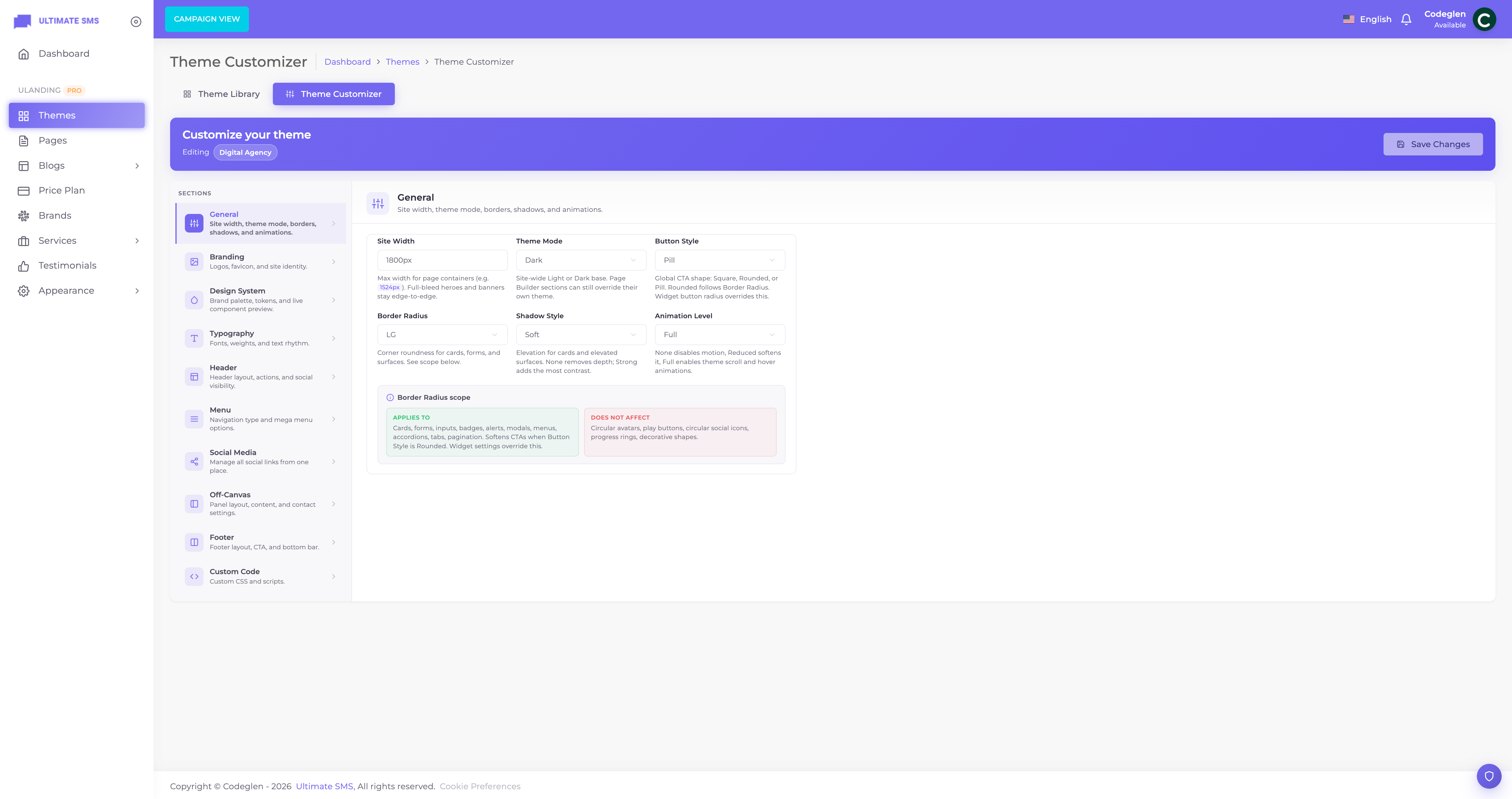
Screenshot: Themes → Customizer (panels on one side, live preview on the other)
How the Customizer works
The Customizer has two parts:
- Panels (a list of setting groups) on one side.
- A live preview of your site on the other.
Pick a panel, change a setting, and watch the preview update. When you're happy, click Save to apply your changes to the live site.
Tip You can jump straight to a panel using a link like
…/themes/customizer?panel=header. The Header, Off‑Canvas and Social settings open this way from older menu links.
The panels
| Panel | What it controls |
|---|---|
| General | Site width, light/dark mode, button style, corner roundness, shadows, animation level |
| Branding | Logo, dark logo, favicon, Apple touch icon, site name |
| Colors | Primary, secondary, accent, success, warning, danger colors |
| Typography | Heading font, body font, weight, base size, line height |
| Header | Header style, sticky, top bar, CTA & auth buttons, header social — see Header |
| Menu | Standard / mega / off‑canvas menu, mega‑menu options |
| Social | Your social media links (shared across header, footer, off‑canvas) |
| Off‑Canvas | The slide‑in side panel — see Off‑Canvas |
| Footer | Footer style, footer CTA, copyright, social, payment icons — see Footer Builder |
| Custom Code | Custom CSS and header/footer scripts |
General panel
| Setting | Options | What it does |
|---|---|---|
| Site width | e.g. 1320px |
Maximum content width on large screens (your container width). |
| Theme mode | Light / Dark | Global site color mode. Sections set to Inherit follow this value. |
| Button style | Square / Rounded / Pill | The shape of buttons across your site. |
| Border radius | None / Small / Medium / Large / XL | How rounded corners are (cards, inputs, etc.). |
| Shadow style | None / Soft / Medium / Strong | The drop‑shadow depth on cards and panels. |
| Animation level | None / Reduced / Full | How much motion your site uses. Reduced is gentler; None disables animations (also the main performance control). |
Tip Choose Reduced or None animation level for a faster, calmer site, or for accessibility (some visitors prefer less motion). See Performance & Cache.
Note There is no separate Performance or Sidebar panel in the Customizer. Use Animation level for motion, Off‑Canvas for the slide‑in panel, and the Widget Builder for the blog sidebar.
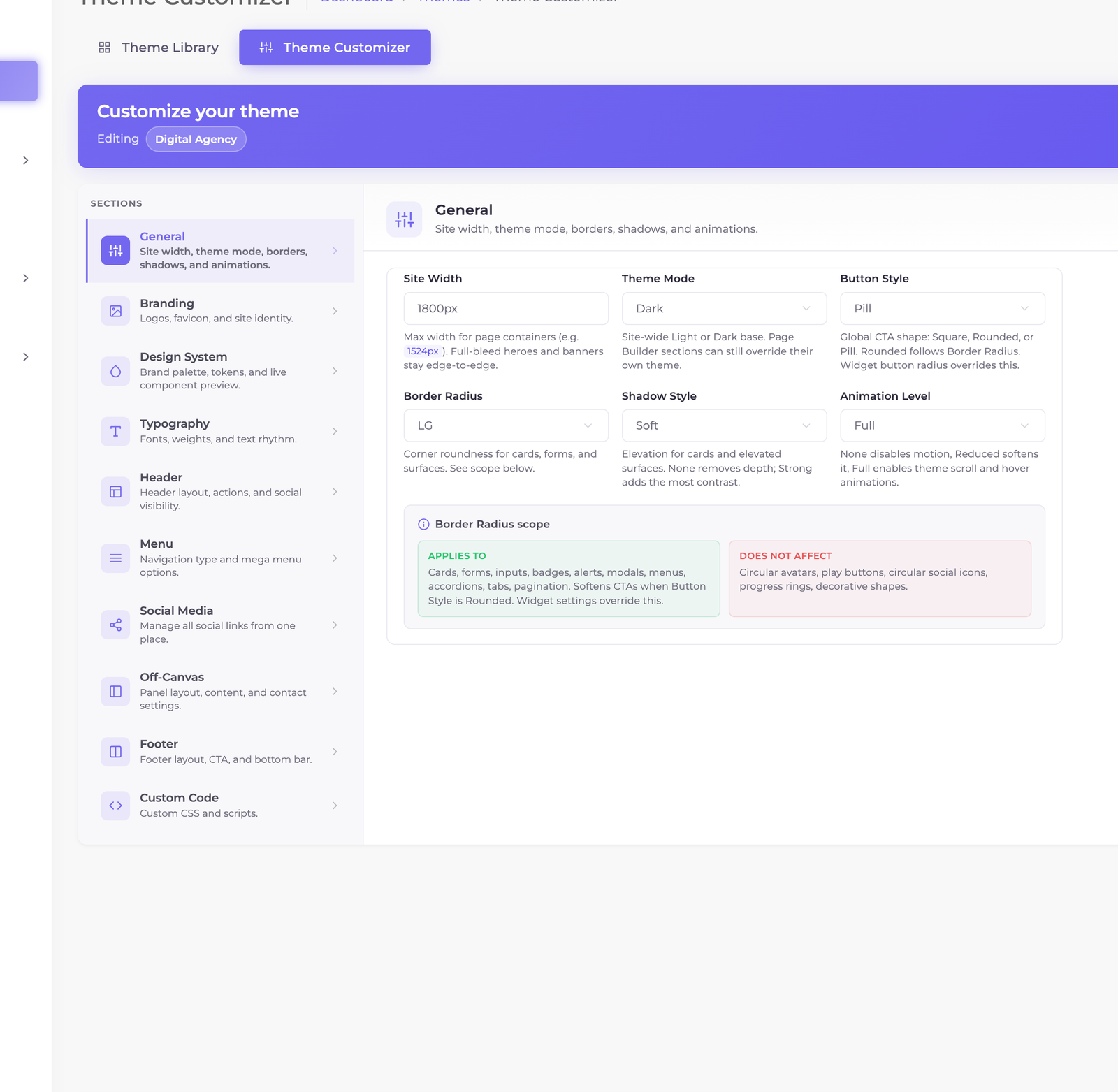
Screenshot: Customizer → General panel
Branding panel
| Setting | What it does |
|---|---|
| Site name | Your business name (used in titles and some widgets). |
| Logo | Your main logo (shown on light backgrounds). |
| Dark logo | A version of your logo for dark backgrounds/dark mode. |
| Favicon | The small icon in the browser tab. Use a square image (e.g. 512×512). |
| Apple touch icon | The icon shown when someone saves your site to an iPhone/iPad home screen. |
Each upload has a Remove option to clear it.
Tip Upload both a regular logo and a dark logo. uLanding automatically shows the right one depending on the background and color mode, so your logo never disappears.
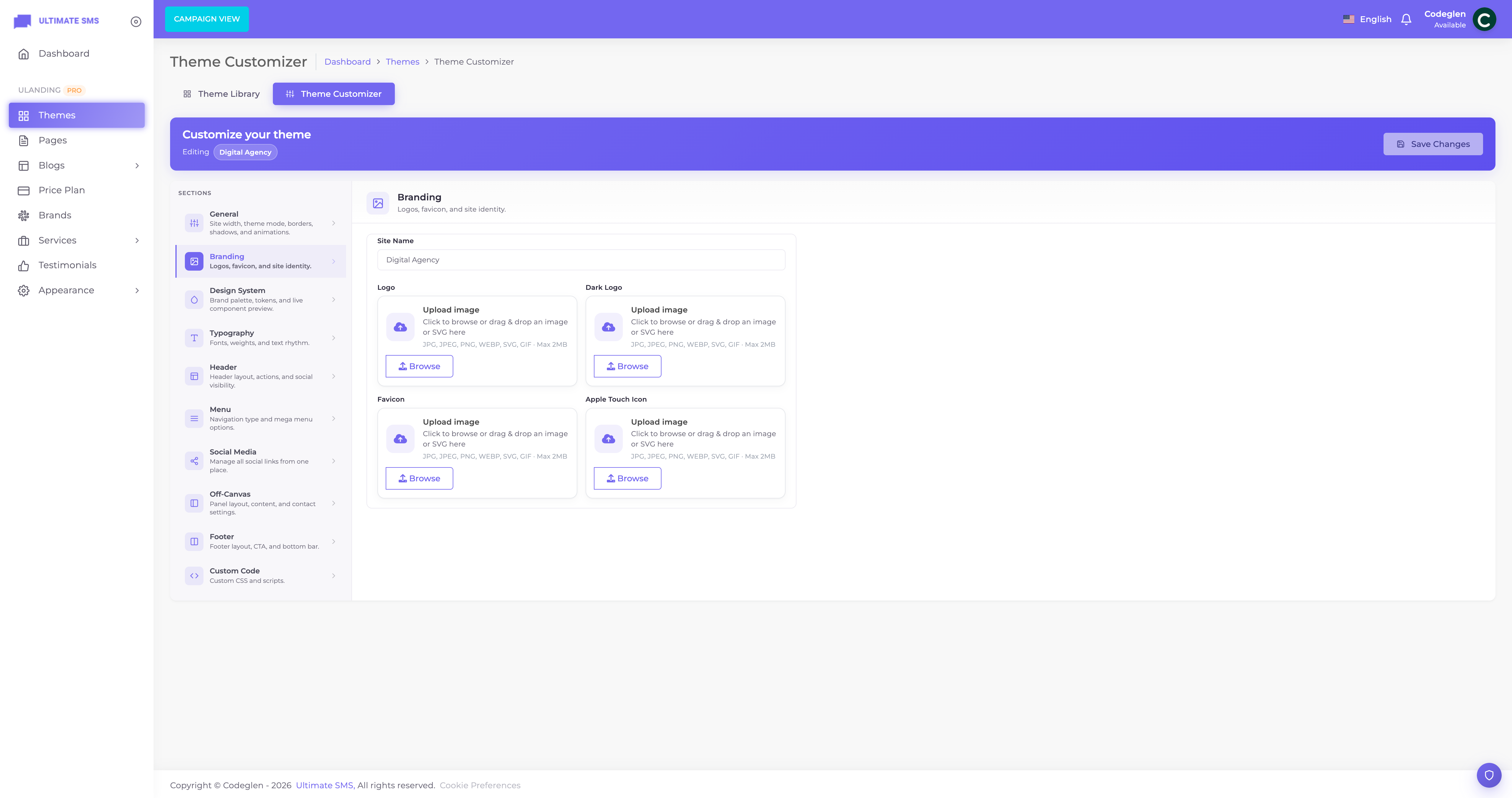
Screenshot: Customizer → Branding panel with logo uploads
Colors panel
Set your brand colors. The preview updates instantly.
| Color | Default | Used for |
|---|---|---|
| Primary color | #C4EE18 |
Your main brand color — buttons, links, highlights. |
| Secondary color | #030303 |
Supporting color — often dark backgrounds/text. |
| Accent color | #6366F1 |
A secondary highlight color. |
| Success color | #22C55E |
Success messages and positive states. |
| Warning color | #F59E0B |
Warnings and cautions. |
| Danger color | #EF4444 |
Errors and destructive actions. |
Tip Set your primary color to your brand's main color first — it has the biggest visual impact. Leave success/warning/danger at their defaults unless you have a reason to change them.
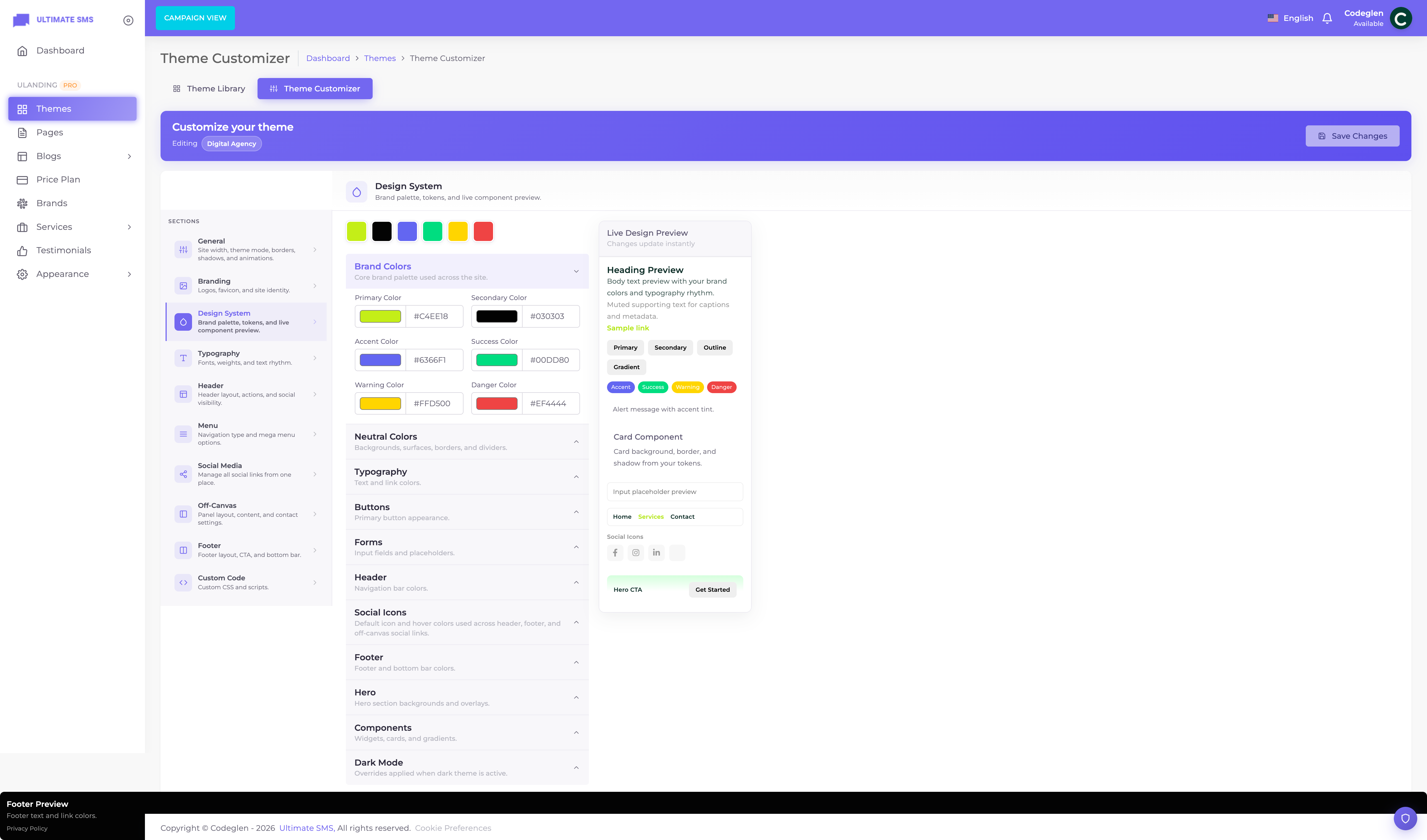
Screenshot: Customizer → Colors panel
Typography panel
| Setting | Default | What it does |
|---|---|---|
| Heading font | Inter | Font for headings/titles. |
| Body font | Inter | Font for paragraphs and general text. |
| Font weight | 400 | Default text thickness (300 = light, 700 = bold). |
| Base font size | 16px | The default text size. |
| Line height | 1.6 | The vertical spacing between lines of text. |
Tip For readability, keep your body font simple and your base size at 16px or larger. Use a distinctive heading font for personality and a clean body font for comfort.
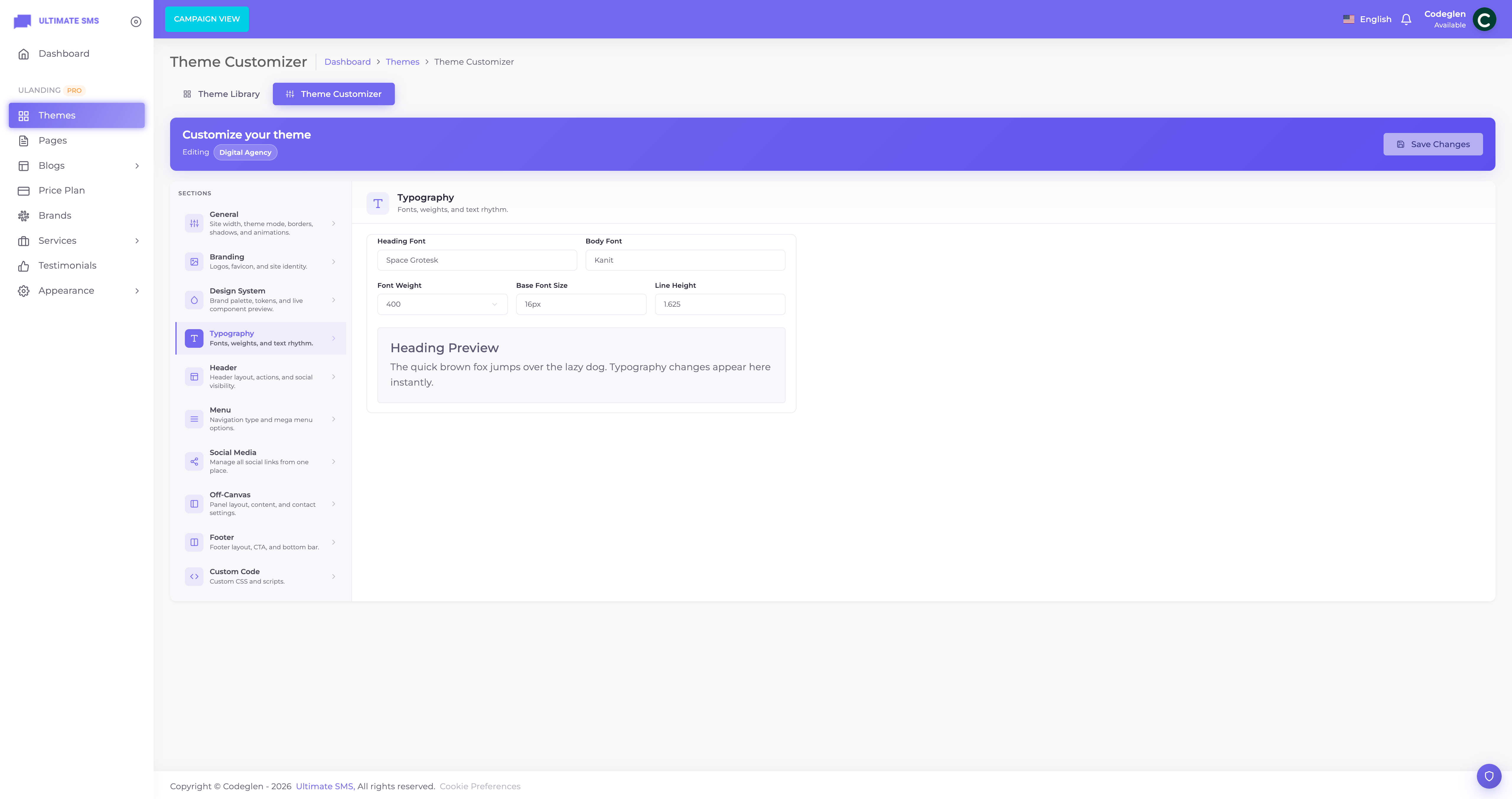
Screenshot: Customizer → Typography panel
Menu panel
Controls how your main navigation behaves.
| Setting | Options | What it does |
|---|---|---|
| Menu type | Standard / Mega / Off‑canvas | How the main menu is displayed. Standard = normal bar with dropdowns. Mega = large multi‑column dropdowns. Off‑canvas = menu lives in the slide‑in panel. |
| Off‑canvas type | Standard / Split | The layout style of the slide‑in panel. |
| Mega menu enabled | On / Off | Turn the mega menu feature on. |
| Mega menu max columns | 1–6 | How many columns a mega‑menu dropdown can use. |
| Show icons | On / Off | Show icons next to mega‑menu items. |
| Show thumbnail | On / Off | Show preview images in the mega menu. |
| Show badge | On / Off | Show badges (e.g. "New") on items. |
| Show CTA | On / Off | Show a call‑to‑action block inside the mega menu. |
➡️ See Menus for how to build the menu items themselves.
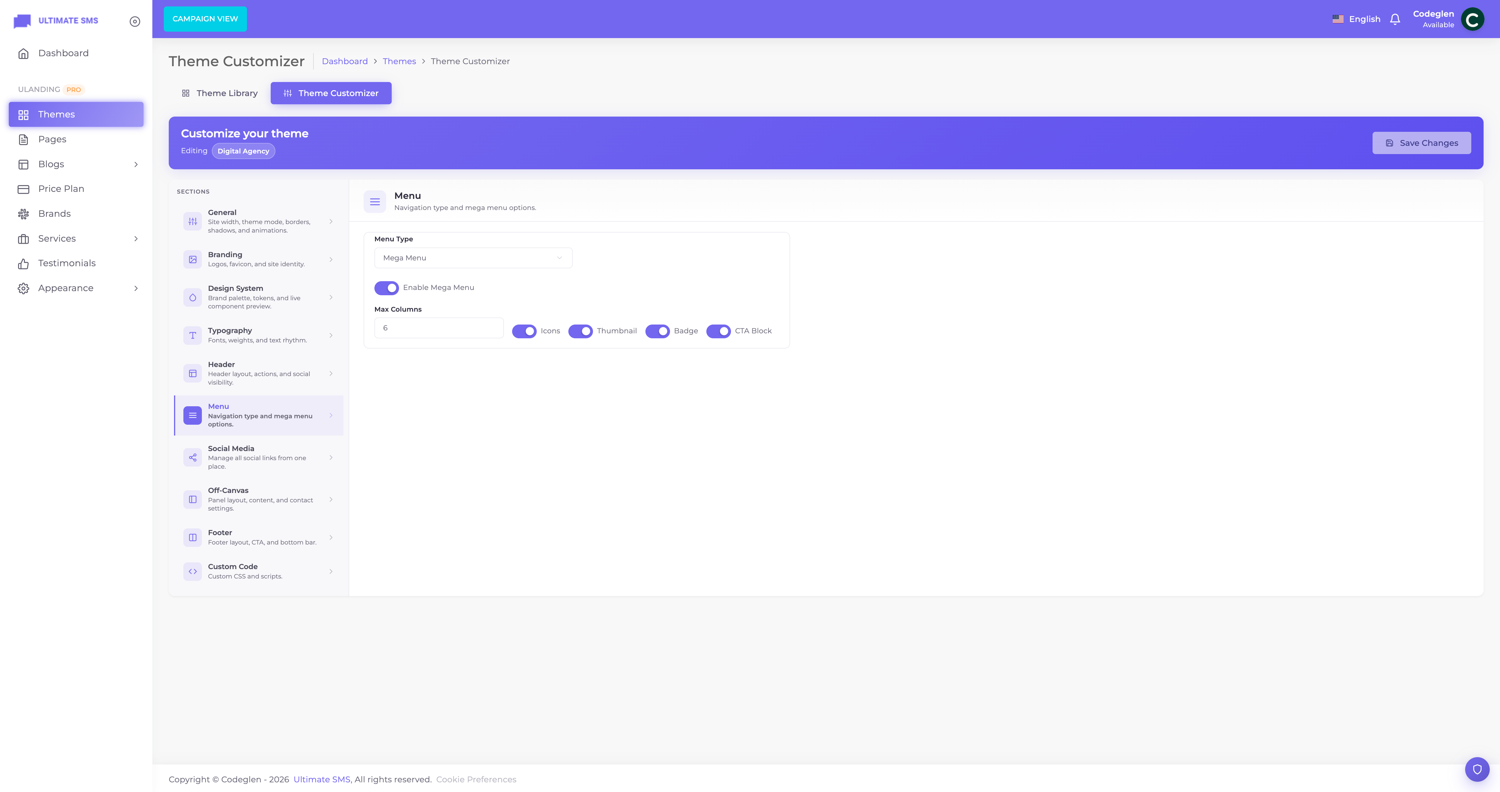
Screenshot: Customizer → Menu panel
Social panel
Add your social media accounts once here, and they can appear in your header, footer and off‑canvas panel.
For each link you set:
- Platform — Facebook, Twitter/X, Instagram, LinkedIn, YouTube, TikTok, WhatsApp, Telegram, Discord, GitHub, Pinterest, Behance, Dribbble, Medium, or Custom.
- Icon — auto‑filled from the platform (or set your own for "Custom").
- URL — the link to your profile.
- Open in new tab — recommended on.
- Nofollow — optional, for SEO.
- Active — show or hide this link.
- Sort order — drag to reorder.
Tip You only enter your social links once here. Where they appear (header/footer/off‑canvas), their size, style and alignment are controlled in those individual panels.
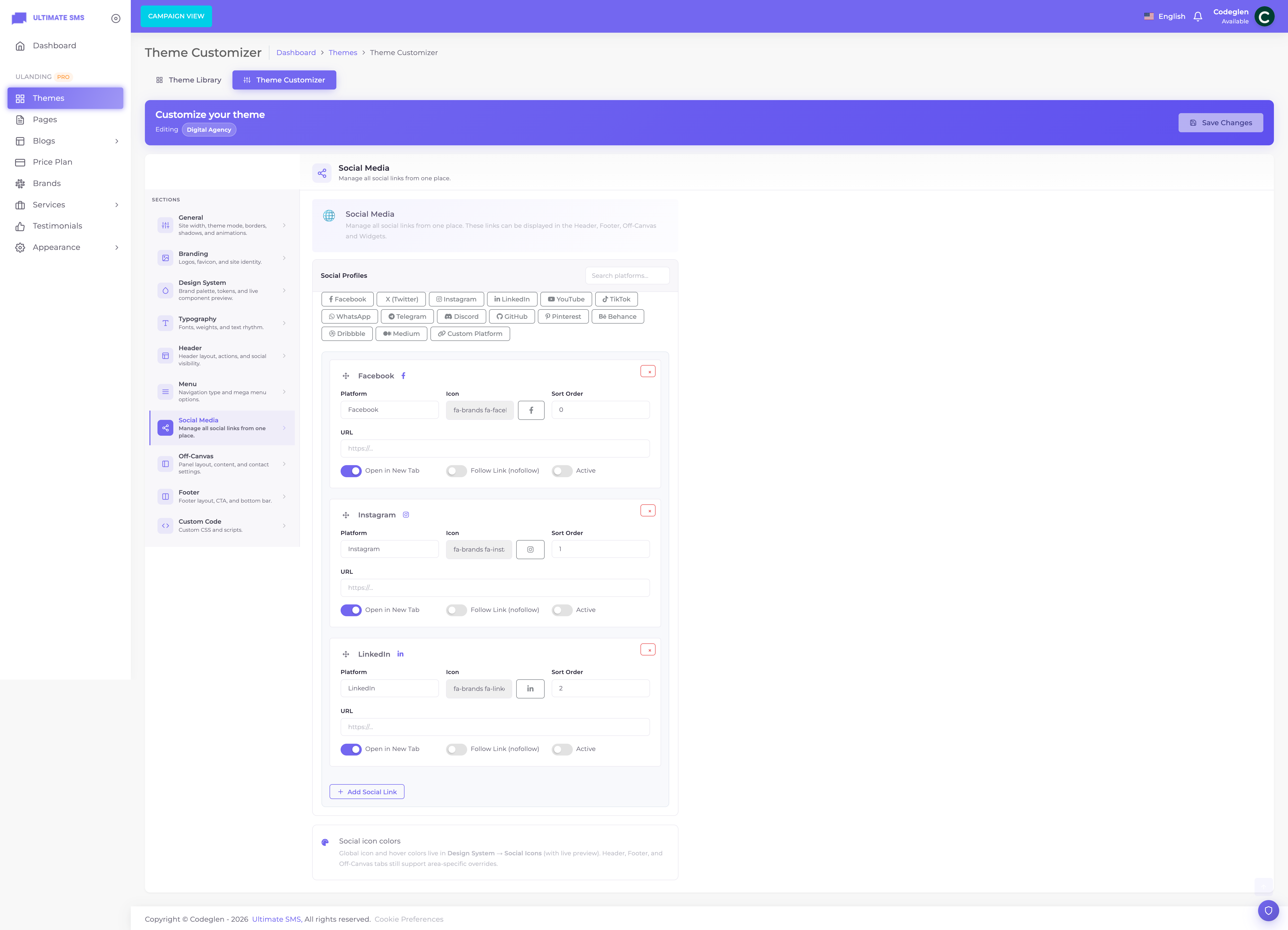
Screenshot: Customizer → Social panel with platform links
Custom Code panel
For advanced users who want to add their own styles or tracking scripts.
| Field | Where it's injected | Typical use |
|---|---|---|
| Custom CSS | Site‑wide styles | Fine‑tune spacing, colors or hide an element. |
| Header scripts | Just before </head> |
Google Analytics, fonts, meta tags. |
| Footer scripts | Just before </body> |
Chat widgets, tracking pixels. |
Warning Be careful with custom code. A broken script or CSS rule can affect your whole site. Test changes on a staging copy if possible, and keep a backup of what you paste.
Example To add Google Analytics, paste your GA snippet into Header scripts and click Save.
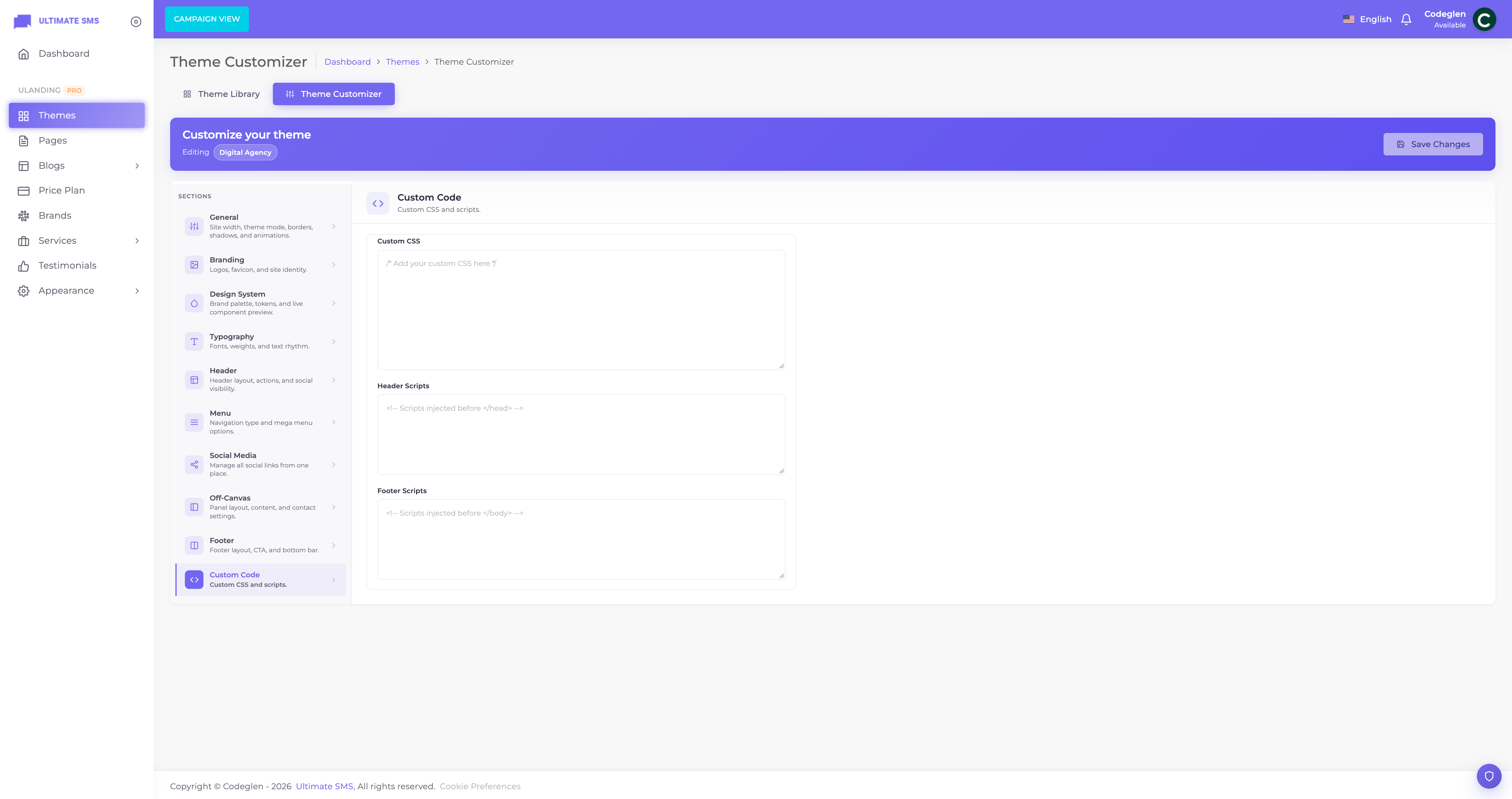
Screenshot: Customizer → Custom Code panel
Live preview & saving
- Changes appear in the live preview as you make them.
- The preview can be switched between desktop, tablet and phone widths.
- Nothing affects your live site until you click Save.
- After saving, your changes are live immediately (theme caches are cleared automatically).
Note If a change doesn't appear on your live site after saving, clear caches with
php artisan optimize:clear. See Troubleshooting.
What's in the other panels
The Header, Off‑Canvas and Footer panels are large enough to have their own chapters:
- Header — header styles, sticky, top bar, CTA & auth buttons, search, social.
- Off‑Canvas — the slide‑in side panel.
- Footer Builder — footer style, CTA, copyright, payment icons.
Continue to Header.