Header
The header is the bar at the top of every page — it holds your logo, menu, and buttons. uLanding gives you full control over its style and content from Themes → Customizer → Header.
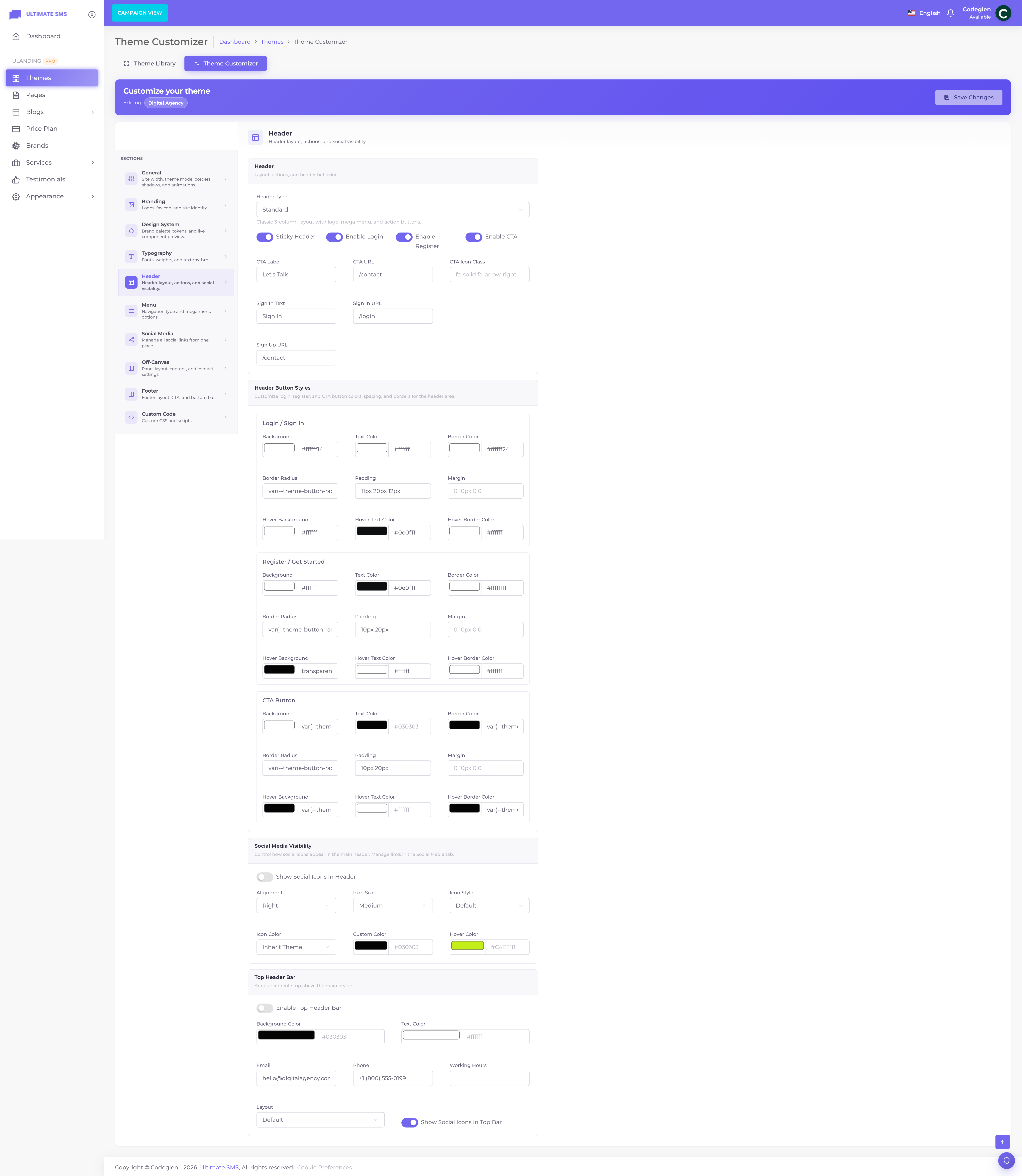
Screenshot: Customizer → Header panel
Header types (styles)
Choose the overall header design with Header type. Each style suits a different look:
| Header type | Description |
|---|---|
| Standard | Classic 3‑column layout: logo, menu, action buttons. |
| Agency | A "call us" link plus a gradient call‑to‑action button. |
| Creative | Dual logo with Sign In and an outline CTA button. |
| SEO | Compact, with a pill‑shaped Sign‑Up button. |
| Minimal | Stripped‑back, non‑sticky, with inline location/email. Menu lives in the off‑canvas. |
| Creative Agency | A circle‑text‑circle CTA group. |
| SaaS | Web‑design style with a search icon and a slim CTA. |
| Startup | Logo and navigation share one flexible row. |
| AI | Dark background with an AI‑style pill button. |
Tip When you activate a theme, its recommended header type is selected for you. You can switch to any other style here.
Sticky header
| Setting | What it does |
|---|---|
| Sticky header | When on, the header stays fixed at the top as visitors scroll, so the menu is always reachable. |
Note The Minimal and Creative Agency header types are designed to be non‑sticky by default.
Transparent header
When the first visible section is a Hero, many headers can sit over it with a transparent or theme-aware background, then solidify when sticky/scrolled. Behavior depends on header type and theme defaults (background mode, sticky background, logo light/dark mode).
| Goal | What to adjust |
|---|---|
| Logo readable on a dark hero | Upload both Logo and Dark logo in Branding |
| Always-solid bar | Prefer a solid-style header type, or adjust via Custom CSS |
| Overlay hero look | Use a Hero-first homepage with the theme’s recommended header |
Logo
Upload logos in Customizer → Branding:
- Logo — for light backgrounds
- Dark logo — for dark backgrounds / dark mode
The header picks the correct logo automatically when light/dark modes change.
Top bar
The top bar is a thin strip above the main header, great for announcements and contact details.
| Setting | What it does |
|---|---|
| Top bar enabled | Turn the top bar on or off. |
| Top bar layout | Default / Centered / Split / Minimal — how the items are arranged. |
| Background color | The strip's background color. |
| Text color | The strip's text color. |
| A contact email shown in the bar. | |
| Phone | A contact phone number. |
| Working hours | E.g. "Mon–Fri 9–6". |
| Show social | Show your social icons in the top bar. |
There's also an announcement feature (set in the Off‑Canvas builder's Top bar tab) for a promotional message that can scroll like a marquee. See Off‑Canvas.

Screenshot: A site with the top bar enabled
Call‑to‑action (CTA) button
A prominent button in the header, usually "Let's Talk", "Get a Quote" or "Contact".
| Setting | What it does |
|---|---|
| CTA enabled | Show or hide the button. |
| CTA label | The button text (e.g. "Let's Talk"). |
| CTA URL | Where it links (e.g. /contact). |
| CTA icon | An optional icon on the button. |
Button styling
You can fully style the CTA button (and the Sign In / Sign Up buttons) with these controls:
- Background color & hover background
- Text color & hover text color
- Border color & hover border color
- Border radius (roundness)
- Padding (size) and margin (spacing)
Tip Make your CTA button stand out by giving it your primary color and plenty of padding. It's often the most important button on your site.
Authentication buttons (Sign In / Sign Up)
These buttons let visitors log in or register.
| Setting | Default | What it does |
|---|---|---|
| Show Sign In | On | Show the Sign In button. |
| Sign In text | "Sign In" | The button label. |
| Sign In URL | /login |
Where it links. |
| Show Sign Up | On | Show the Sign Up button. |
| Sign Up text | "Let's Talk" | The button label. |
| Sign Up URL | /contact |
Where it links. |
Each button has the same full styling controls as the CTA button.
Note "Sign Up" doubles as a CTA in many themes — that's why its default text is "Let's Talk" and it points to
/contact. Change it to/registerand "Sign Up" if you want a true registration button.
Logo
The logo shown in the header comes from Customizer → Branding (your Logo and Dark logo). The header automatically picks the right one for the background. To change the logo, see Branding.
The logo width defaults to 150px and adapts per theme.
Menu & mega menu
The header's main menu uses the menu you build in Appearance → Menu Manage and assign as the default. How it displays (standard dropdowns vs. mega menu) is set in Customizer → Menu.
- Standard menu — a normal bar with simple dropdowns.
- Mega menu — large, multi‑column dropdowns that can include icons, thumbnails, badges and a CTA.
➡️ See Menus and the Menu panel.
Search
Some header styles include a search icon that opens a full‑screen search overlay.
| Setting | What it does |
|---|---|
| Show search | Show the search icon in the header. |
Note Search availability depends on the header type. The SaaS and Standard styles commonly include it.
Header social icons
Show your social links (from Customizer → Social) in the header.
| Setting | Options |
|---|---|
| Show social | On / Off |
| Alignment | Left / Center / Right |
| Size | Small / Medium / Large |
| Style | Default / Rounded / Circle / Square |
| Color mode | Inherit (use theme colors) / Custom |
| Color & hover color | Used when color mode is Custom |
Container width
The header content respects your site's overall container width (set in Customizer → General → Site width) and the active theme's container size. Wider themes (e.g. container-1800) give a more spacious header; narrower themes (e.g. container-1524) feel more compact.
Header summary checklist
- [ ] Pick a header type that matches your theme
- [ ] Decide sticky on/off
- [ ] Set up the top bar (or turn it off)
- [ ] Configure your CTA button (label + link)
- [ ] Set Sign In / Sign Up text and links (or hide them)
- [ ] Confirm your logo shows correctly on light and dark backgrounds
- [ ] Choose standard vs. mega menu
- [ ] Add header social icons if you want them
Continue to Off‑Canvas Panel.