Footer Builder
Your footer is built in two places that work together:
- Appearance → Widget Builder — where you drag widgets (logo, links, contact info, newsletter, etc.) into footer columns. This is the content of your footer.
- Themes → Customizer → Footer — where you set the footer's style (layout, background, CTA, copyright, social, payment icons).
This page covers both. For the full list of footer widgets, see Widget Builder.
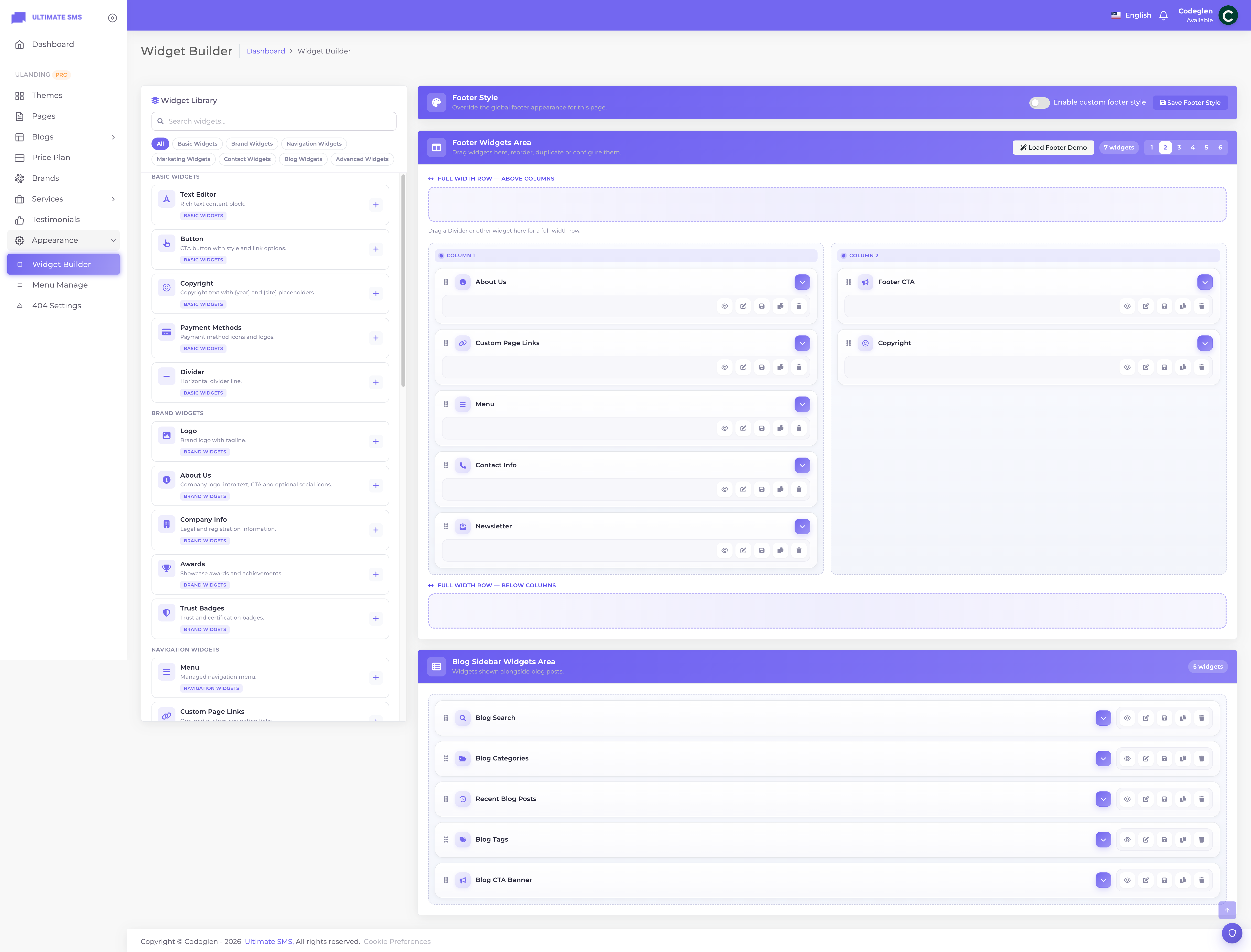
Screenshot: Appearance → Widget Builder (footer area with columns)
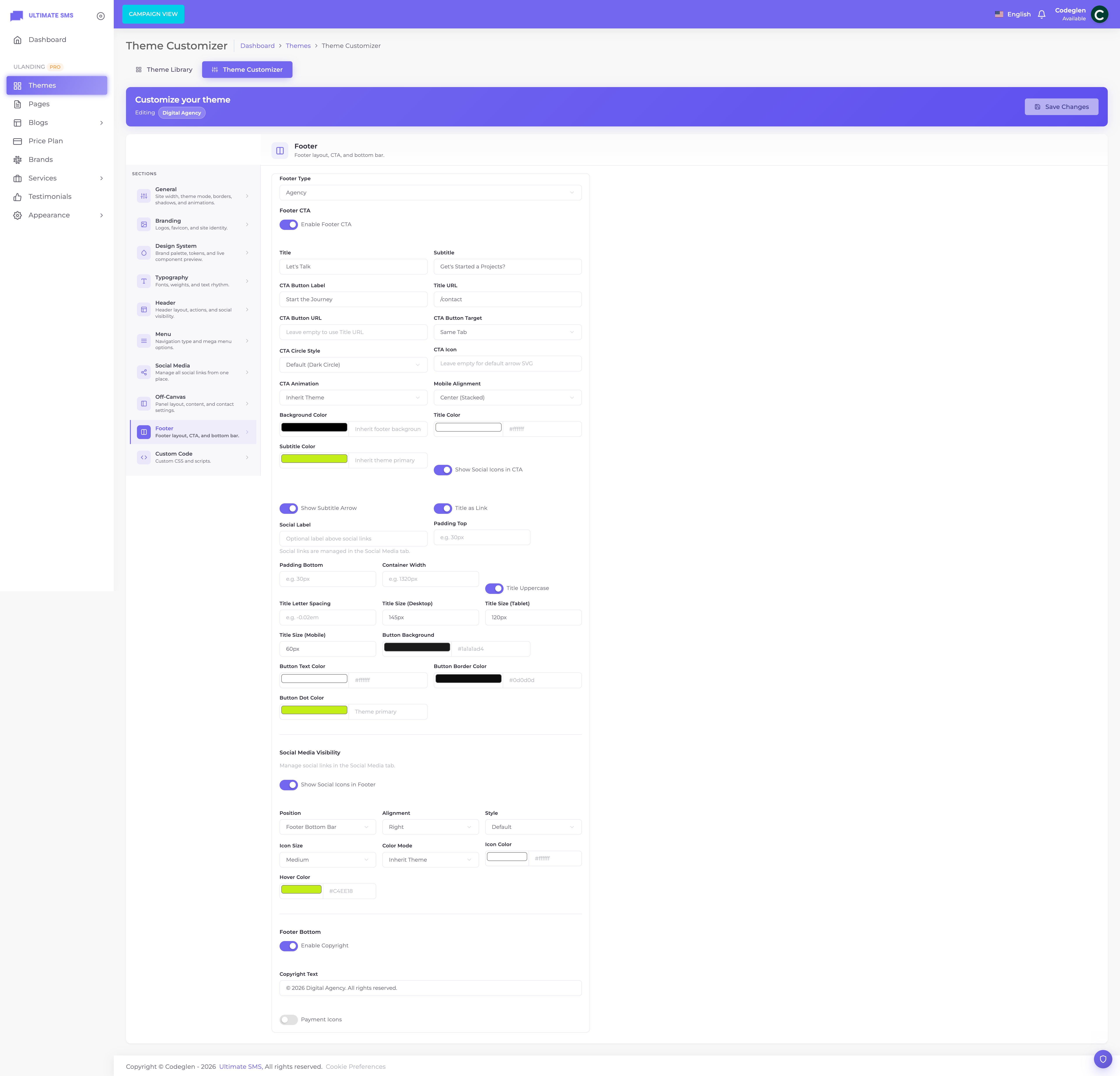
Screenshot: Customizer → Footer panel
Part 1 — The footer's content (Widget Builder)
Go to Appearance → Widget Builder and select the Footer area.
Columns
Your footer is divided into columns (1 to 6). Choose how many with the column selector. The default is 4.
| Columns | Typical use |
|---|---|
| 1 | Simple, centered footer |
| 2 | Logo + links |
| 3 | Balanced 3‑block footer |
| 4 | The classic agency footer (default) |
| 5 | Content‑rich footer (special grid) |
| 6 | Maximum density |
Adding widgets
- Drag a widget from the library into a column.
- Click it to edit its content.
- Click Save.
You can reorder widgets by dragging, duplicate them, delete them, and preview the footer live.
Full‑width zones (footer only)
The footer has special full‑width drop zones above and below the columns. Widgets placed here span the entire footer width (great for a Footer CTA or a Divider). Choose before (above the columns) or after (below them).
Divider rows
The Divider widget creates a horizontal line across the footer. Place it in a full‑width zone to separate sections. You can set its style (line or dots), color, width and spacing. See Widget Builder → Divider.
Seed demo footer
The Seed Footer Demo button replaces all footer widgets with a ready‑made example footer for your theme. Useful as a starting point.
Warning Seeding the demo footer replaces your current footer widgets. Use it on a fresh footer, not after you've customized it.
Part 2 — The footer's style (Customizer → Footer)
Go to Themes → Customizer → Footer.
Footer layout type
| Setting | Options | What it does |
|---|---|---|
| Footer type | Agency / Portfolio / SEO / IT / AI | The overall footer design that wraps your widgets. |
Note Each theme has a recommended footer type, set automatically when you activate it.
Footer CTA
A call‑to‑action block at the very top of the footer.
| Setting | What it does |
|---|---|
| Footer CTA enabled | Show the CTA. |
| CTA title | The heading. |
| CTA subtitle | A small line above the title. |
| CTA button | The button text. |
| CTA URL | Where the button links. |
Footer social
| Setting | Options |
|---|---|
| Show social | On / Off |
| Position | Before widgets / After widgets / Bottom bar |
| Alignment | Left / Center / Right |
| Style | Default / Rounded / Circle / Filled |
| Size | Small / Medium / Large |
| Color mode | Inherit / Custom |
| Color & hover color | Used when Custom |
Copyright
| Setting | What it does |
|---|---|
| Copyright enabled | Show the copyright line. |
| Copyright text | Your copyright. Use {year} for the current year and {site} for your site name. |
Example
© {year} {site}. All rights reserved.renders as© 2026 Your Company. All rights reserved.
Payment icons
| Setting | What it does |
|---|---|
| Show payment icons | Display credit‑card / payment method icons in the footer bottom bar. |
The footer bottom bar
The footer bottom is the thin strip at the very bottom of the footer. It can contain:
- Your copyright text.
- Social icons (when social position is set to "Bottom bar").
- A secondary menu (e.g. quick links).
- Legal links (Privacy Policy, Terms of Use).
- Payment icons.
- Trust badges.
These options come from the Customizer footer panel and the legacy footer‑bottom settings.

Screenshot: Footer bottom bar with copyright, legal links and payment icons
How the footer renders (the order)
When your footer displays, the pieces appear in this order:
- Footer CTA (if enabled)
- Social icons (if positioned "before widgets")
- Full‑width widgets placed "before"
- The column widgets
- Full‑width widgets placed "after"
- Social icons (if positioned "after widgets")
- The footer bottom bar (if enabled)
Footer background, colors & spacing
The Widget Builder includes a footer style control for the footer's overall look:
| Setting | Options / notes |
|---|---|
| Enabled | Turn the custom footer style on. |
| Background type | None / Color / Gradient / Image / Pattern |
| Background color | The footer background color. |
| Gradient from / to / angle | For gradient backgrounds. |
| Background image | An image background, with size (cover/contain/auto) and position. |
| Overlay | An optional color overlay over the background, with adjustable opacity. |
| Container width | How wide the footer content is. |
| Padding top / bottom | Vertical spacing inside the footer. |
| Top border | An optional line at the top of the footer, with width and color. |
Tip A dark footer with a subtle top border and generous padding looks polished on almost any site.
Column layout reference
| Columns | How they stack on desktop / mobile |
|---|---|
| 1 | Full width |
| 2 | Two side‑by‑side, stack on mobile |
| 3 | Three across, stack on mobile |
| 4 | Four across, two per row on tablet, stacked on mobile |
| 5 | Special five‑column grid |
| 6 | Six across, fewer per row on smaller screens |
uLanding handles all the responsive stacking for you automatically.
Footer checklist
- [ ] Choose your number of footer columns
- [ ] Add the widgets you need (logo, links, contact, newsletter, social)
- [ ] Add a Footer CTA (optional)
- [ ] Set copyright text with
{year}and{site} - [ ] Turn on legal links and payment icons (optional)
- [ ] Style the footer background and padding
- [ ] Preview and Save
Continue to Legacy Theme Settings.